We’ve been privileged to design and redesign several websites since Webster Digital Marketing, Inc. was founded in 2014. In addition to the Webster Digital Marketing website, here are some other websites we’ve created. Our websites are mobile responsive (so they look good on any size screen) and SEO friendly. See more about our website design services here.
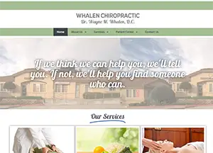
Whalen Chiropractic is one of the foremost chiropractic practices in the San Diego area. Dr. Whalen needed a fresh look for his website that would help his business to be found on search while also helping his patients and prospective patents to find the information they needed.
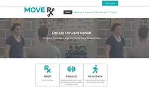
MoveRX is a newly formed physical therapy service. After branching out on her own, the owner needed a new website to feature her services, new podcast, and promote her business. Webster Digital Marketing completed the creation of the content, design, and a user-friendly website.
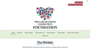
Millard Business Community Foundation wanted to build a completely new website that could house all their various forms necessary to run their year-round programming. Webster Digital Marketing completed the creation of over a dozen unique forms and an update, user-friendly website.

Apex Performance and Chiropractic came to Webster Digital Marketing to re-create their existing on a platform that would better serve their SEO goals. We build this site on WordPress with the intention to optimize their SEO performance.

Print Me Bind Me, located in the Dallas/Fort Worth area, has been in the book printing business for more than 30 years. It's a family business that can deliver all around the Dallas, Texas. Webster Digital Marketing helped them build their new website.

Sierra Packaging requested a completed re-design of their website to make it more modern and user friendly. We completed a complete facelift on their existing website.

A&K Marketing requested a completed re-design of their website to make it more modern and user friendly. We completed a complete facelift on their existing website.

Dumpster Services is a new business that needed a complete website built from scratch. We wrote all the content as well as created the design and feel of the website based of their brand guidelines.
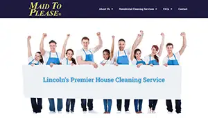
Maid To Please requested a completed re-design of their website to make it more modern and user friendly. We completed a complete facelift on their existing website.
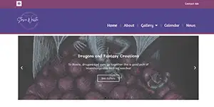
The Art of Stasia Webster is a new venture of our owner, Anastasia Webster. Here you can find galleries of her artwork and also order her artwork. We wrote all the content and designed the entire website.

After the previous Paraclipse website built by another company suffered a critical error, Webster Digital Marketing went about the difficult task of re-creating and updating the website in record time.

Excel Leadership Solutions is a unique website built with specific requests and directions from it's founder, Deborah Schroeder-Saulnier. We wrote all the content, transferred articles written by Deborah and designed the entire website.
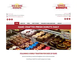
This donut company had two different locations with separate websites. The goal was to create one website for both locations, while still providing a distinct understanding for customers which locations was which.

Built website for Safe Retirement Annuities to feature his unique services and partnerships. The goal of this website was to not only design a more modern site, but also increase their content.

Author Lamar Owens wanted a website to showcase his books and give visitors more insight about himself. After spending decades working in the casino gaming industry, he writes mostly about his experiences.
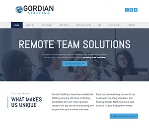
Gordian's previous website had very little information about their services. The goal of this website was to not only design a more modern site, but also increase their content. WDM wrote all their new copy in addition to designing a new site.
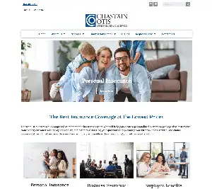
This insurance company started blogging and doing internet marketing through email, social media, and SEO and needed a new website to make the best use of those marketing efforts. In addition, they have a newsletter signup form that puts new subscribers right into Constant Contact for them.

The website for Cinderella's didn't accurately reflect their current product line any more. We were able to create a site with several image galleries to give visitors a better idea of the dresses they would find in the store.
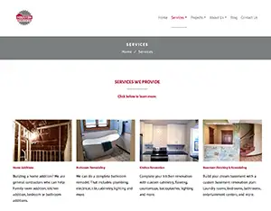
Houston Remodeling Services had a website that was only one page. It didn’t have very much information about the services they offer and it wasn’t ranking very well on search engines. As part of an overall marketing program, we provided a website redesign, including writing all the content for the new site.
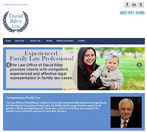
An experienced family lawyer in Omaha, David Riley had never had a website that he really liked. The sites he had in the past all had a lot of scales of justice and generic law images he didn’t feel represented his image. We worked with him to create a site to represent his take on family law. We even designed his logo!

Big Red’s had a website that could not be updated easily by the owner or any of his employees. Our new website made updating easier, along with allowing him to track conversions from Google AdWords.

For Nebraska Yard Care, we created a website that is not only suited to blogging but allows them to show a portfolio of their work. This website is very simple, but it is also effective, marketing friendly, search-engine friendly, mobile friendly, and user friendly.